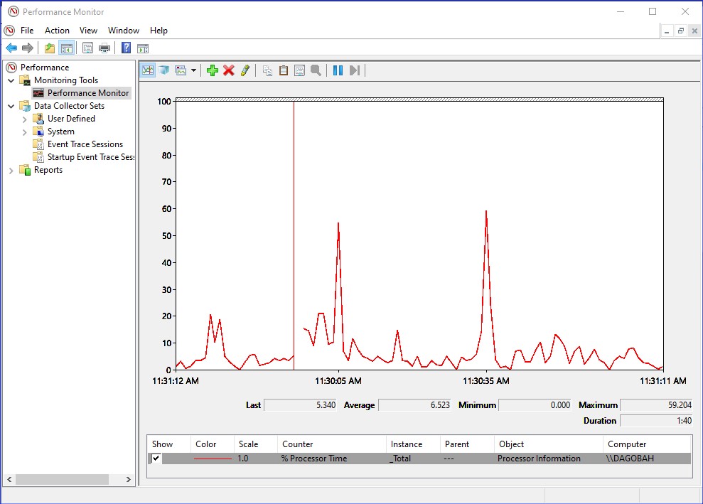
Performance Monitor or PerfMon (perfmon.exe), has been part of Windows for over 25 years. It has been a valuable tool for server admins, giving in-depth insight into the performance of our servers. When something was slow or broken, the way to start troubleshooting was with PerfMon and performance counters.
A few days ago, I was at Microsoft Ignite 2019 where they announced a new, reimagined Performance Monitor. Along with some new features, it got a nice facelift! For those of you who use it often, you know it is a great tool, but the classic user interface hasn’t changed very much in a long time. Many admins found it difficult to work with and time-consuming to learn. But it always gives me a little nostalgic grin when I open it up. Go ahead, launch perfmon.exe, and take a trip back in time.
The New Windows Performance Monitor
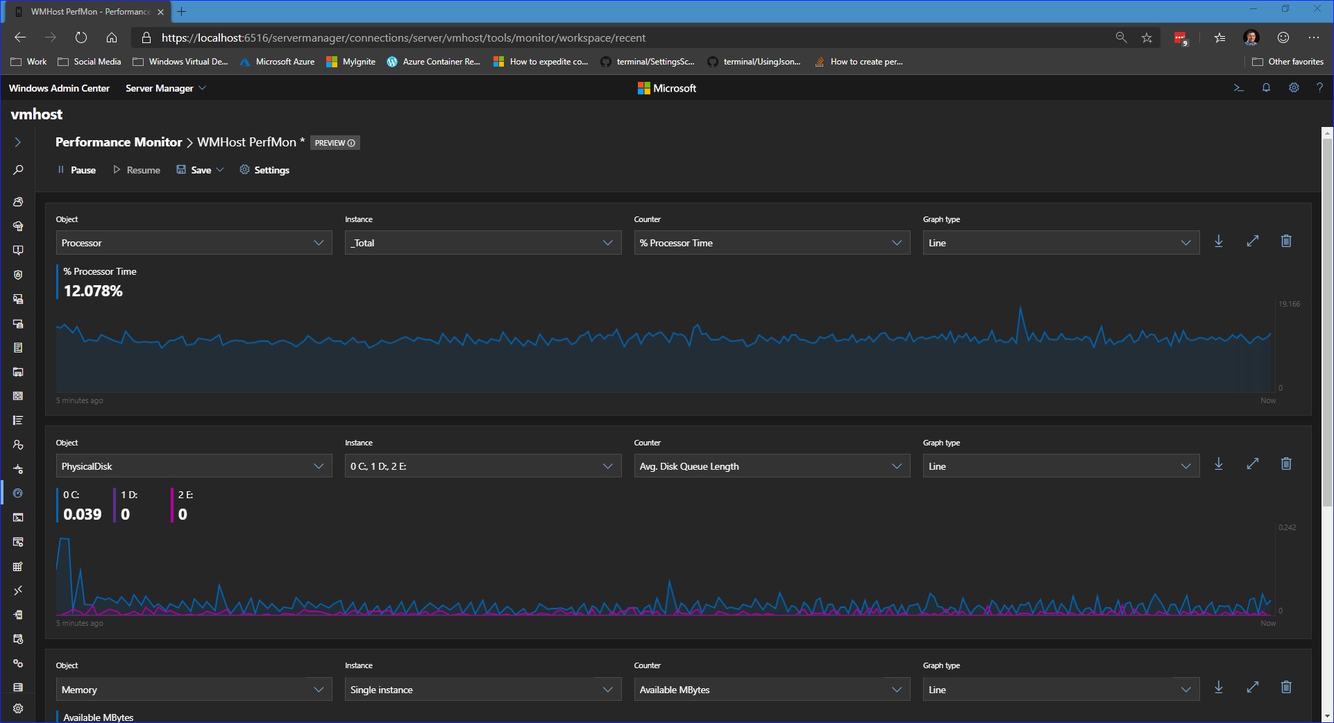
The new Performance Monitor is available in preview as part of Windows Admin Center version 1910 which you can download here. The Windows Admin Center is amazing, make sure you check back for more details as new features roll out.
New Look
I love the new user interface. It’s a complete redesign, and it has a modern app look and feel. Everything is sharp and vibrant, and of course, it’s available in light and dark theme.
Functionality
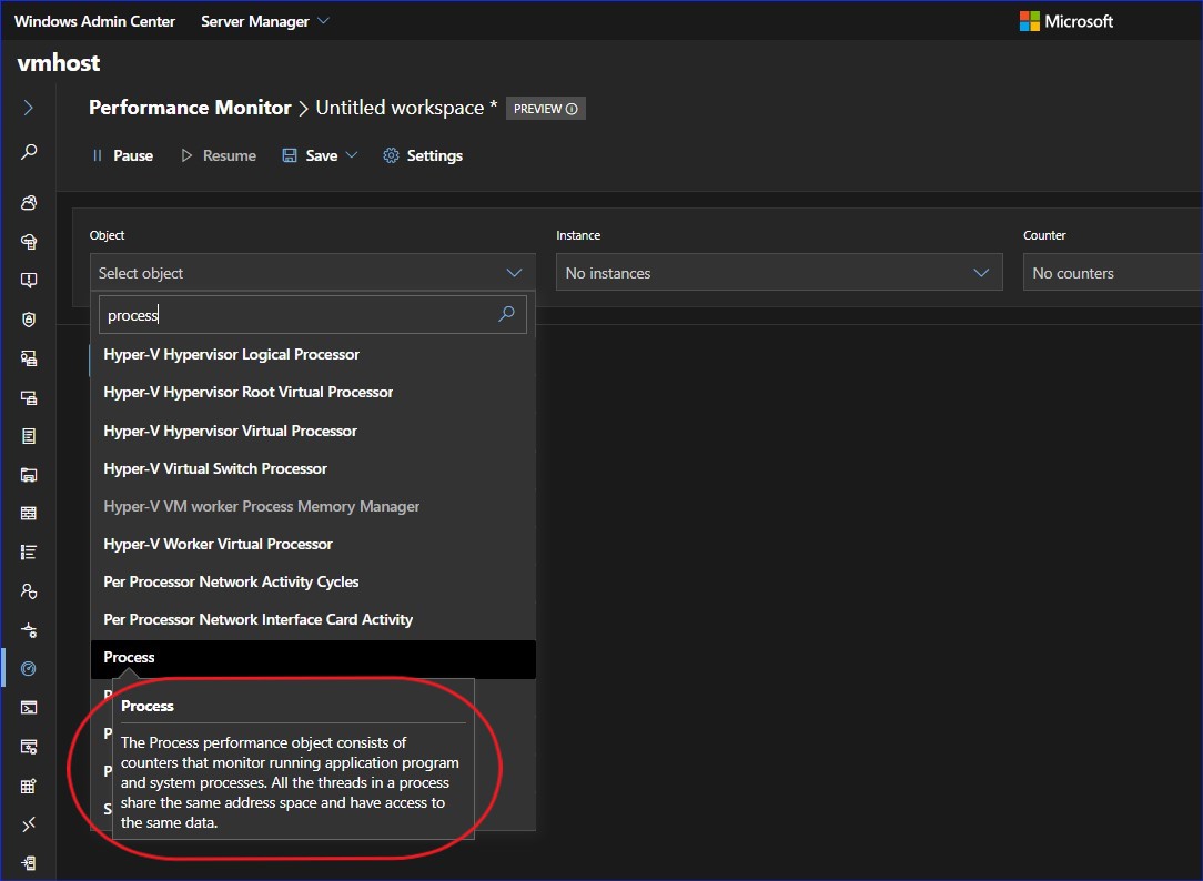
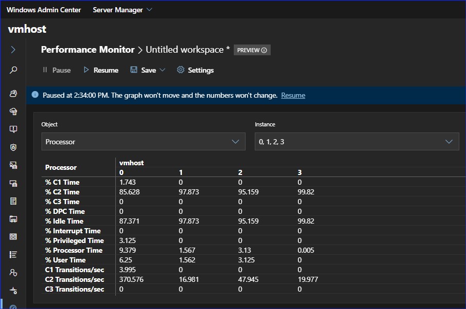
As with the original Performance Monitor, you add performance counters for the objects you want to monitor. There are 1000s of counters available. Start by keyword searching to narrow the list of objects, then select the instance and counter you want.
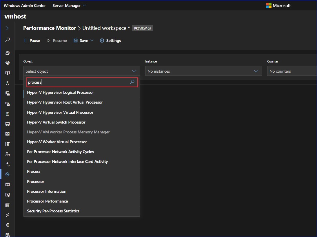
Which objects should you monitor? Details about each counter appear as a tooltip when you hover over an object to help you decide.
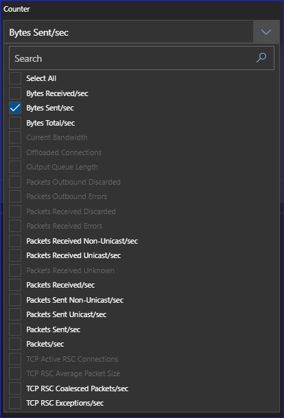
Another great feature is how Performance Monitor will suggest other counters that are relevant based on the ones you have already selected. For example, in the screenshot below, I’ve selected the counter Bytes Sent/sec, and Performance Monitor has suggested others, like Bytes Received/sec and Bytes Total/sec.
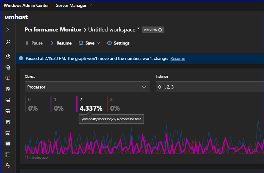
Graph Types
There are several ways to visualize the performance data you are collecting. First, there’s the familiar line graph, which has some cool new features like:
- Hover over a point on the line to get the values at that point in time.
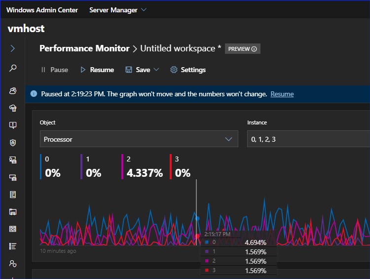
- Hover over the legend to highlight a single line.
The Report View
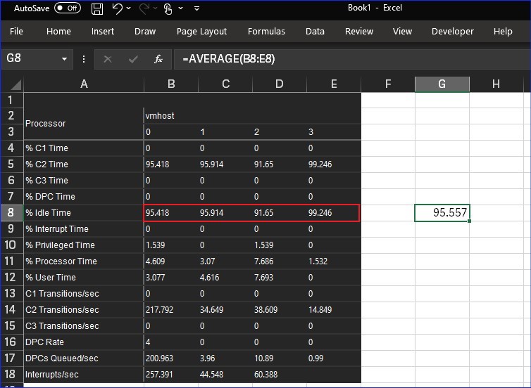
The report view has some cool new features as well. It fully supports copy and paste, you can even copy the whole table to Excel or another Office application. You are pasting values, not an image of the data. Notice the formula below is using the pasted data.
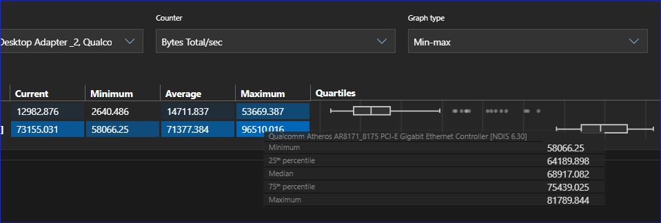
Performance Monitor has introduced a new graph type, Min-max. This shows, of course, minimum and maximum values, as well as current and average values. There is also a box-and-whisker view that shows minimum, maximum, median, as well as the 25th and 75th percentile when you hover over them.
Workspaces
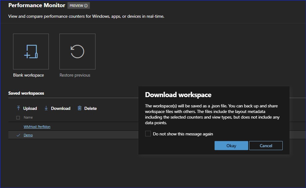
Of course, with all these cool options, it would be a shame if you had to recreate it every time. Guess what? You don’t have to! You can save the counters and graphs you have selected as a Performance Monitor workspace.
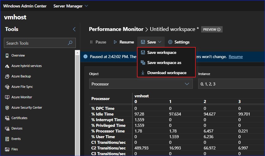
But wait, there’s more! You can also download a workspace, as a backup or a way to share a workspace with others. Workspaces are saved as a .json file, which will include the layout data, selected counters and view types, but not the data points.
That’s a quick look at some of the cool new features of the new Performance Monitor. So, what are you waiting for? Download Windows Admin Center version 1910 and check out the new Performance Monitor for yourself.
Comments are closed